
How Inequality is Measured
Inequality cannot be fully described by a single statistic. Different measures emphasize different parts of a distribution: some provide an overall summary, while others reveal what is happening near the middle, at the bottom, or among households at the very top. The results on this website therefore use several complementary measures.
The Lorenz Curve and the Gini Coefficient
The Lorenz curve shows how a resource such as income or wealth is distributed across households. Households are ordered from those with the least to those with the most, and the curve reports the cumulative share held by each part of the population.
The diagonal represents perfect equality. Along this line, 50% of households would receive exactly 50% of total income, 80% would receive 80%, and so on. The Lorenz curve falls below this line whenever resources are distributed unequally.
In the figure, A is the area between the line of perfect equality and the Lorenz curve. B is the area beneath the Lorenz curve. Together, A + B make up the entire area beneath the equality line.
The Gini coefficient is calculated as:
\frac{A}{A+B}When the Lorenz curve lies close to the equality line, area A is small and the Gini coefficient is close to 0. As the curve moves farther away, area A becomes larger and the Gini coefficient rises toward 1.
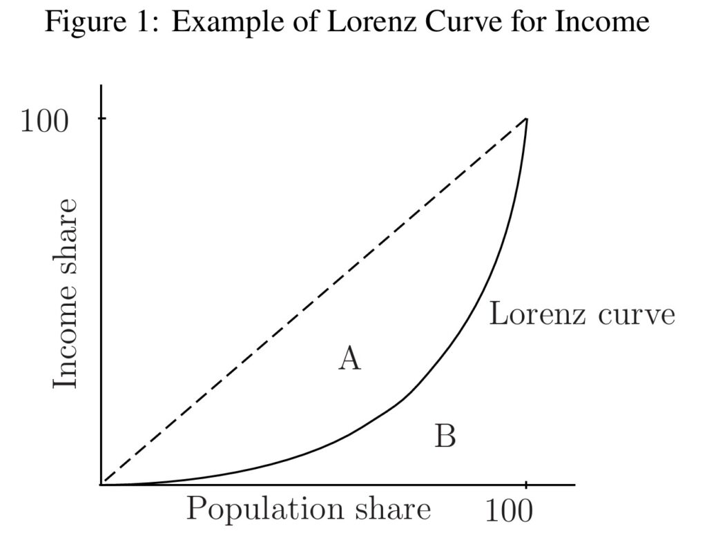
How to read the figure: A larger area A, the area between the equality line and the Lorenz curve, corresponds to a higher Gini coefficient. A higher Gini indicates a more concentrated distribution.
Why one measure is not enough
Gini coefficient
A broad view
Summarizes inequality across the complete distribution and is particularly informative about differences around its middle.
Variance of logarithms
Attention to the bottom
Emphasizes relative differences among households with lower values. Because logarithms cannot be applied to zero or negative values, those observations must be excluded and the measure should be interpreted with care.
Coefficient of Variation
Attention to the top
Gives greater weight to very large deviations from the average. It is therefore especially sensitive to the long upper tails found in income and wealth distributions.
Reading the shape of a distribution
Summary statistics can also describe the shape of a distribution more directly. Earnings, income, and wealth typically have a long right tail: most households are concentrated toward the lower and middle portions of the distribution, while a relatively small number have exceptionally high values.
The markers on Figure 2 identify important positions in the distribution. Ratios between these positions describe the length of its upper and lower tails.
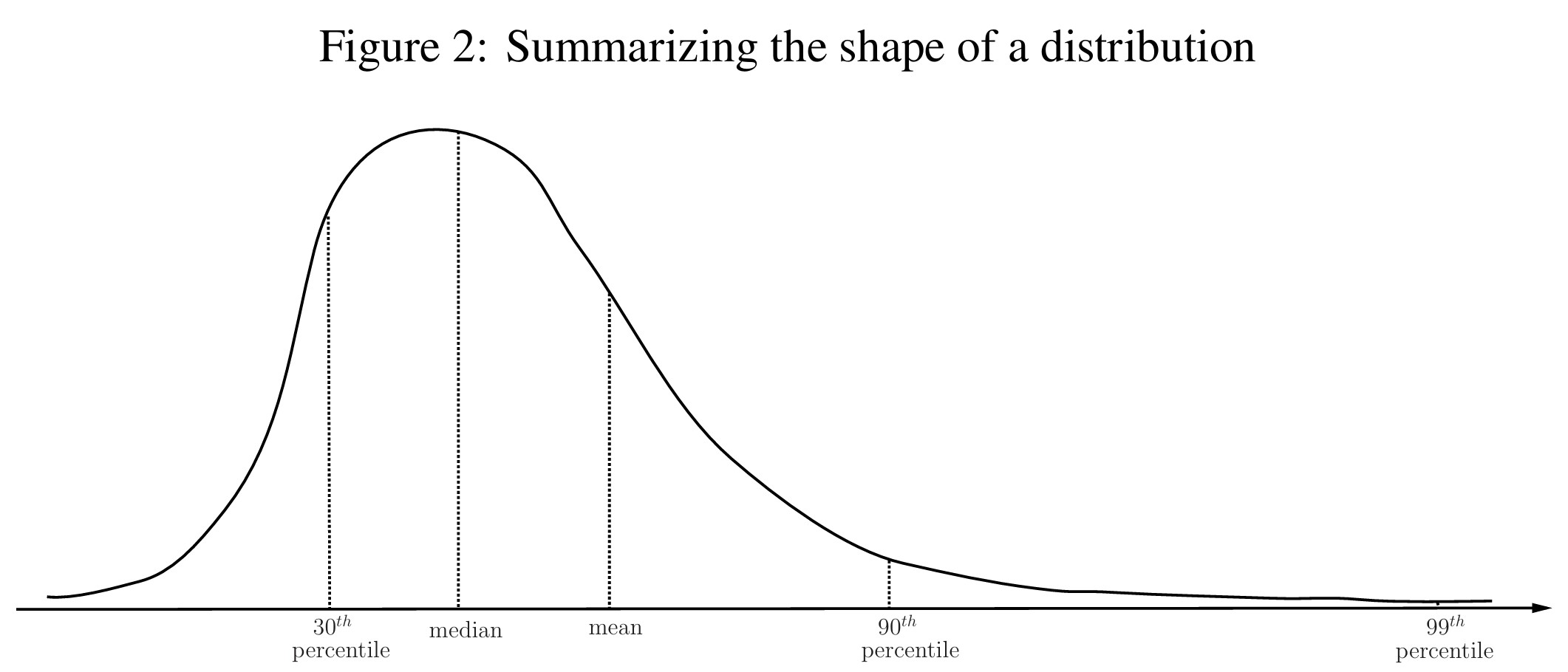
Positions in the distribution
Median
The value held by the household in the middle of the distribution. Half of the households have less and half have more.
Mean
The average across all households. In a distribution with a long upper tail, very high values pull the mean above the median.
Percentile
A household at the 90th percentile has more than 90% of households and less than the remaining 10%.
Comparing positions and measuring skewness
Mean-to-median ratio
Shows how far the average lies above the typical household. A larger ratio indicates greater right-skewness.
90-50 and 99-50 ratios
Compares the upper part of the distribution with the median. They show how far the top 10% or top 1% lies from the middle.
50-30 ratio
Compares the median with a household lower in the distribution an helps describe the length of the lower tail.