
Income Inequality
Using 2022 Survey of Consumer Finances data, this page examines the distribution of household income in the United States. Income is defined as the resources a household receives during a given period, including earnings, capital income, and government transfers, measured before taxes.
Quantiles
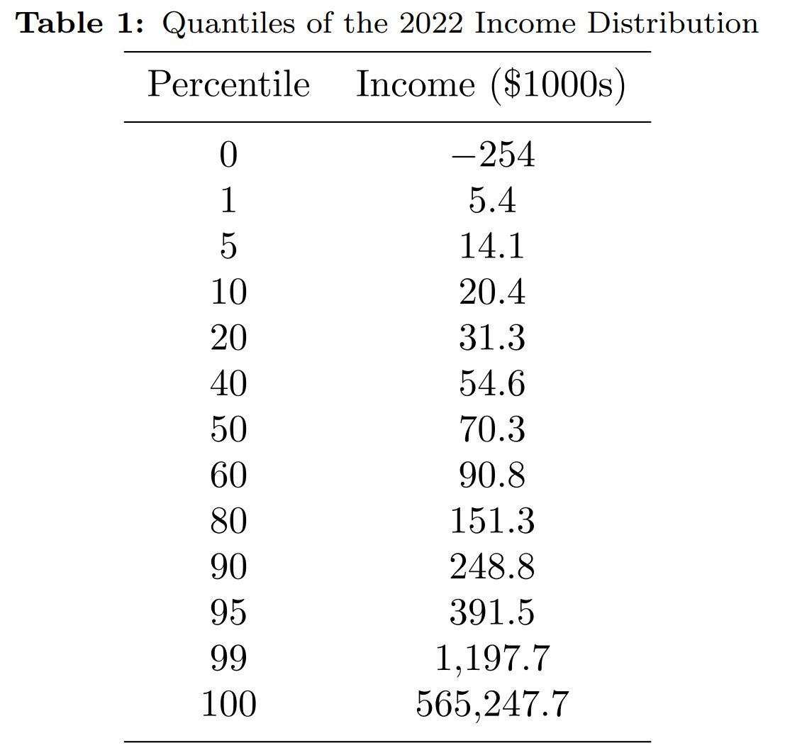
Table 1 reports the distribution in numbers by displaying the quantiles of the income distribution. Each quantile describes the dollar amount so that the corresponding fraction of households has fewer dollars. For example, the 60th quantile of the income distribution indicates the dollar amount so that 60% of the population have less annual income. The median (“typical”) household within each distribution is at the 50th percentile.
We see that half the population make less than $70k which is 40% more than the comparable threshold for earnings. The top 10% earn more than a quarter million and the top 1% more than 1.2 million, about 17 times the median.
Inequality measures
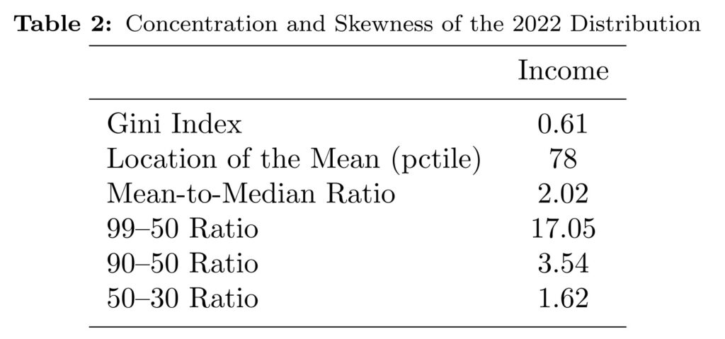
Table 2 summarizes distributional properties on income using standard inequality measures. The Gini coefficient is a statistical measure of economic inequality, typically measuring income or wealth distribution within a population. It ranges from 0 to 1, where 0 represents perfect equality (everyone has the same wealth) and 1 represents perfect inequality (one person holds all the wealth). The Gini coefficient for income in the United States for 2022 is equal to 0.61. In comparison, the Gini coefficient for wealth equals 0.83, which indicates that wealth is more unequally distributed than income.
The lower five rows of Table 2 provide statistics describing distributional asymmetry. In symmetric distributions, the mean would appear at the 50th percentile (the median). Instead, we find the mean at the 78th percentiles for income, indicating pronounced right-skewness. The mean-to-median ratios quantify this asymmetry: 2.02 for income.
The final three rows detail the asymmetry distribution in more detail through percentile ratios relative to the median. The 99-50 ratio captures the distance between the very top and the middle: those at the 99th percentile have 17 times the income of median households. The 90-50 ratio shows that the top 10% have at least 3.5 times the income of the median. The 50-30 ratio reveals that median households possess 1.6 times the income of those at the 30th percentile.